Menüpartner

Dinner is Served!

Design is like food: You eat with your eyes and if it is arranged nicely the taste will be twice as good. inkl.Design set an opulent table for the customers of Menüpartner with an appetizing design.

Menüpartner offers meals for kindergartens and schools in all of Germany. With its constant striving for excellence at a reasonable price this company speaks the same language as us. You can now also tell by their presence that Menüpartner is honestly interested in their little customers: We developed a whole design system for Menüpartner, with a sustainable modular design: colour schemes, fonts, pictogram systems, a fresh imagery and many analogue and digital publications were created by the hand of inkl.Design.

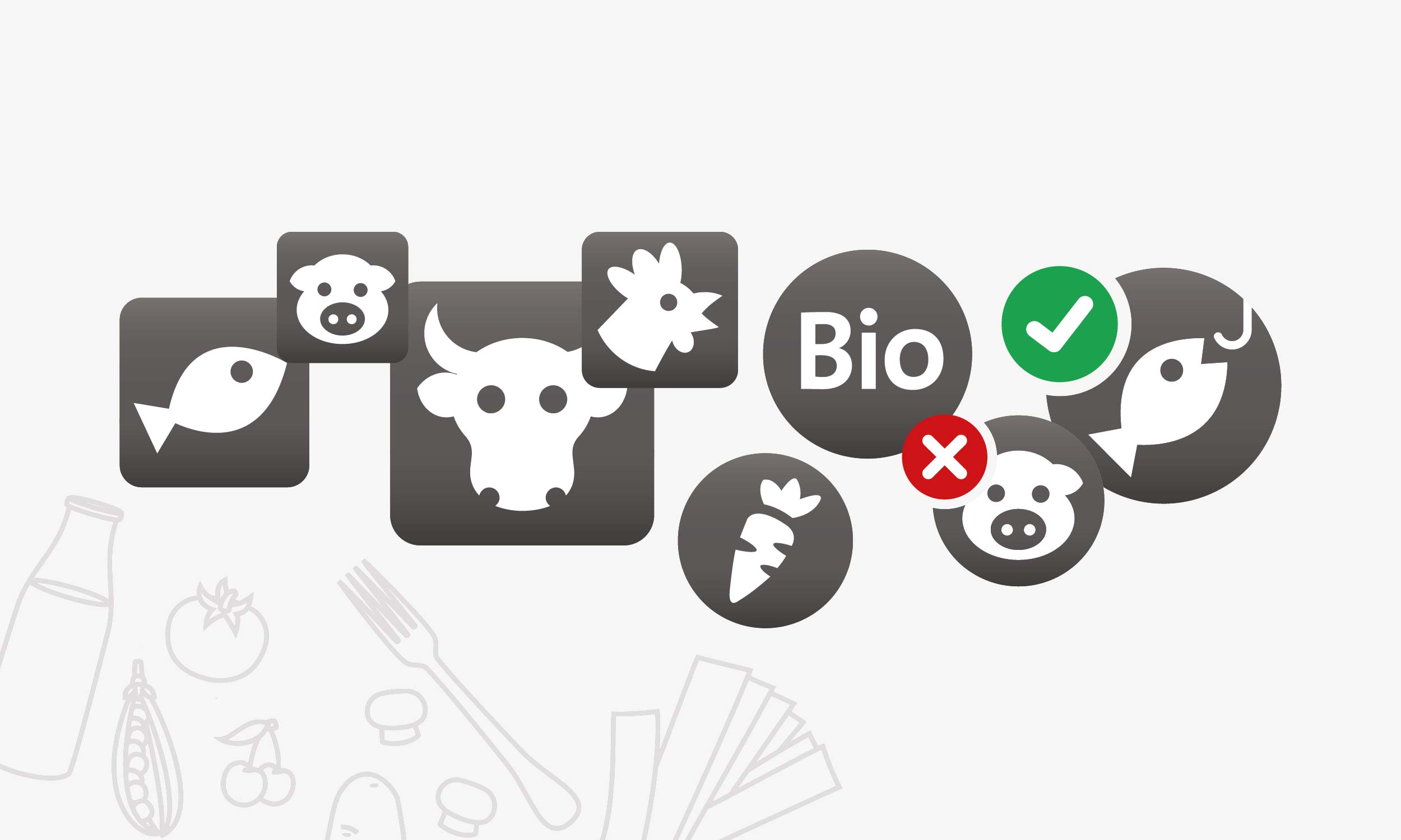
No more misunderstandings – our pictogram systems explain the ingredients of meals, like fish, pork, beef and sub-components like dessert or salad. Each menu line has its own pictogram. Breakfast, lunch and snacks, meal for daycare center kids or school kids; from now on every little gourmand can tell what will end up on their plate immediately.

Since Menüpartner is running canteens all over Germany the requirements can be totally different in various locations. Our solutions for a fresh labelling around food had to consider all possible options.

Flexible and expandable, design for all possibilities: from the appealing menu in different styles to clear labelling and numeration at the counter. The respective canteen can choose the needed labelling. It’s always a perfect fit.

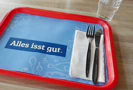
From the trolley to the dish return, trash can and comment box, to lunch bags, napkins, tray mats and lanyards, inkl. gave Menüpartner a new face.

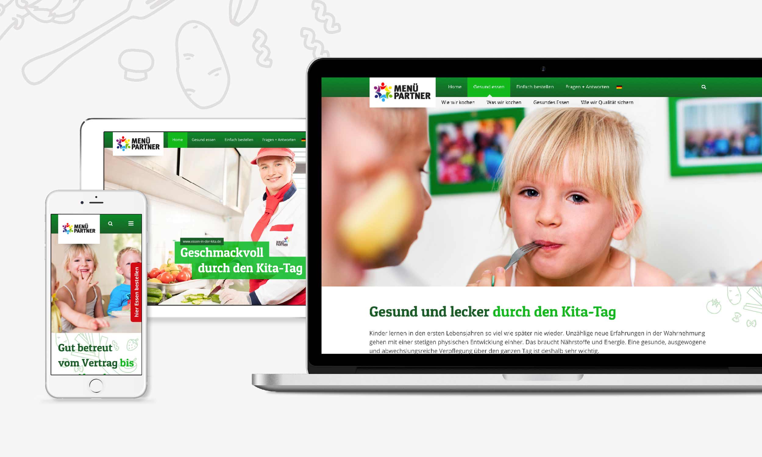
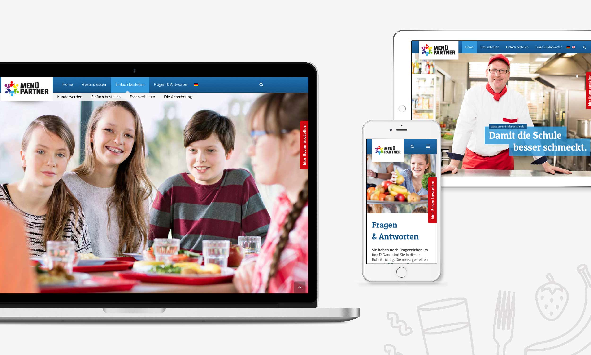
Menüpartner can now offer a visual feast digitally as well. We held photoshoots, wrote texts and spiced up existing content for three completely new designed websites for „Essen in Kitas“ and „Essen in Schulen“ as well as the Menüpartner corporation.

And now everybody: Rub-a-dub-dub. Enjoy your grab!

Graphic Concept
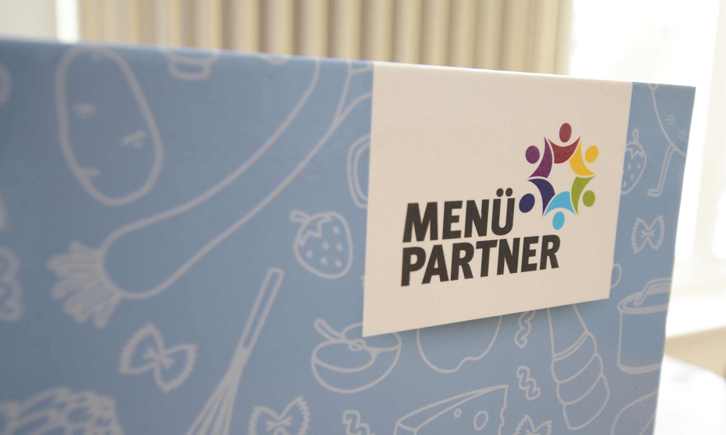
Photo of a designed menu partner ring binder with illustrative food items and the company logo.
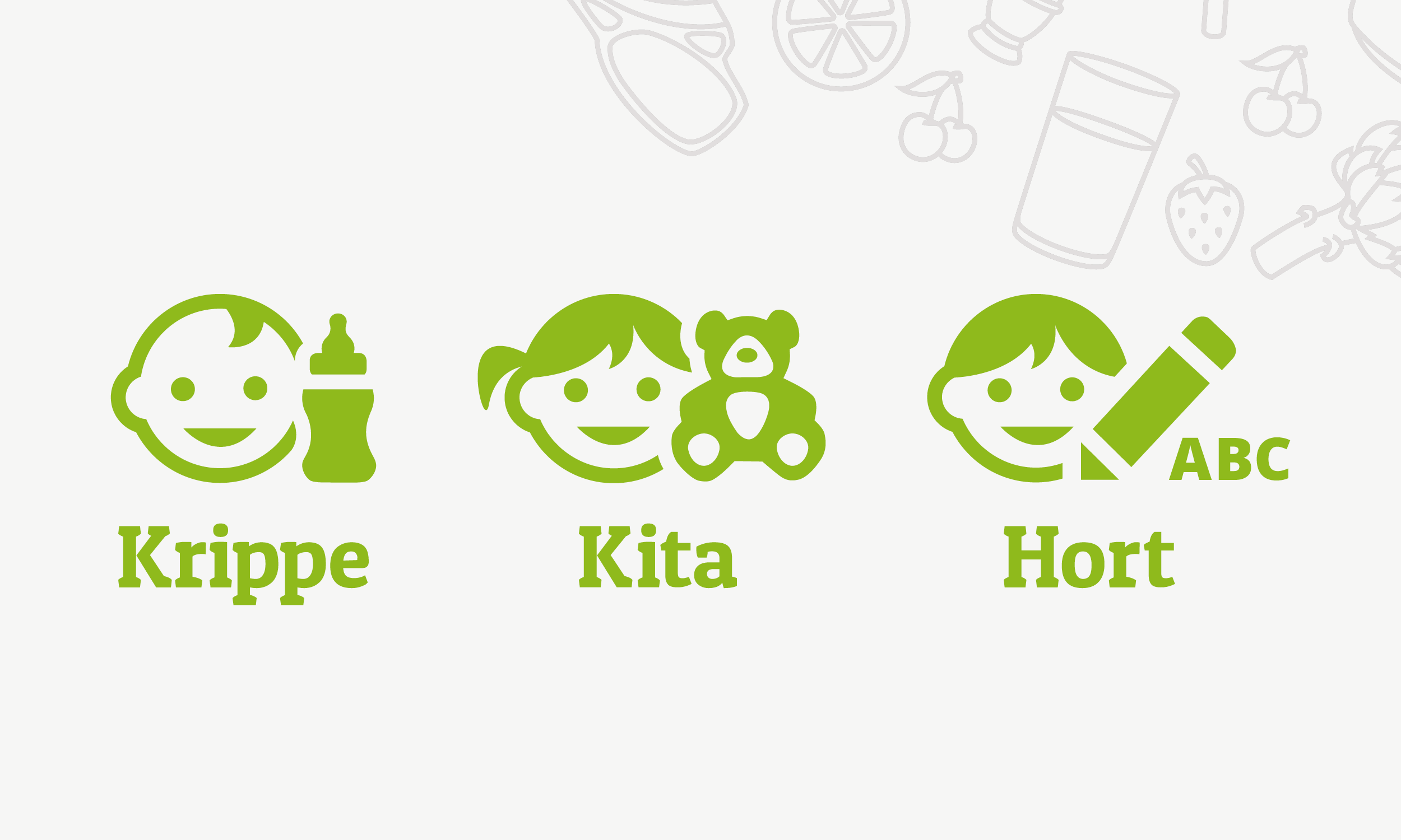
Illustration of three signets for signalling the menu lines crèche, day nursery and after-school care centre
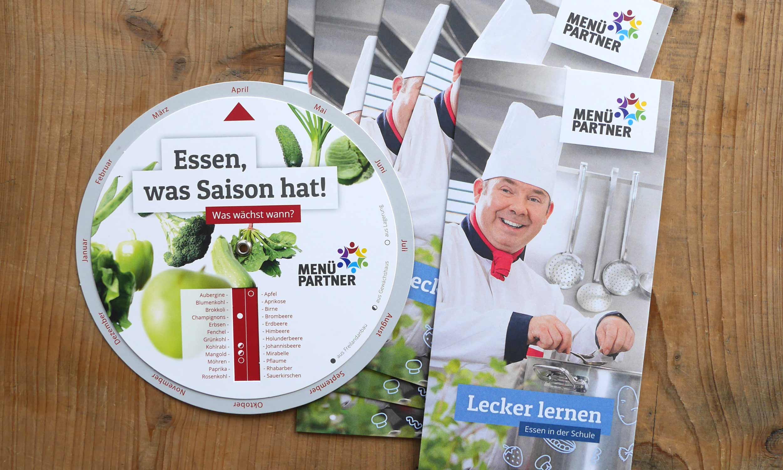
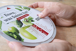
Photo with information material on eating at school and the seasonal range of fruit and vegetables, published by Menüpartner
Illustration of pictograms for labelling food components (fish, pork, beef, poultry, organic, vegetables, without pork, certified fishing methods).
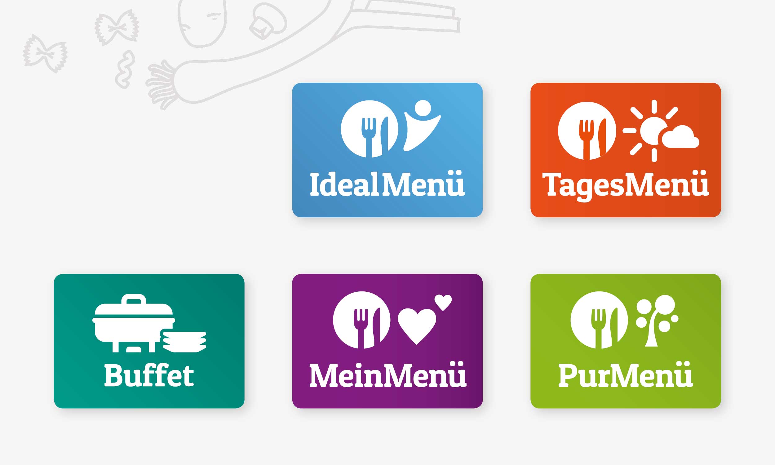
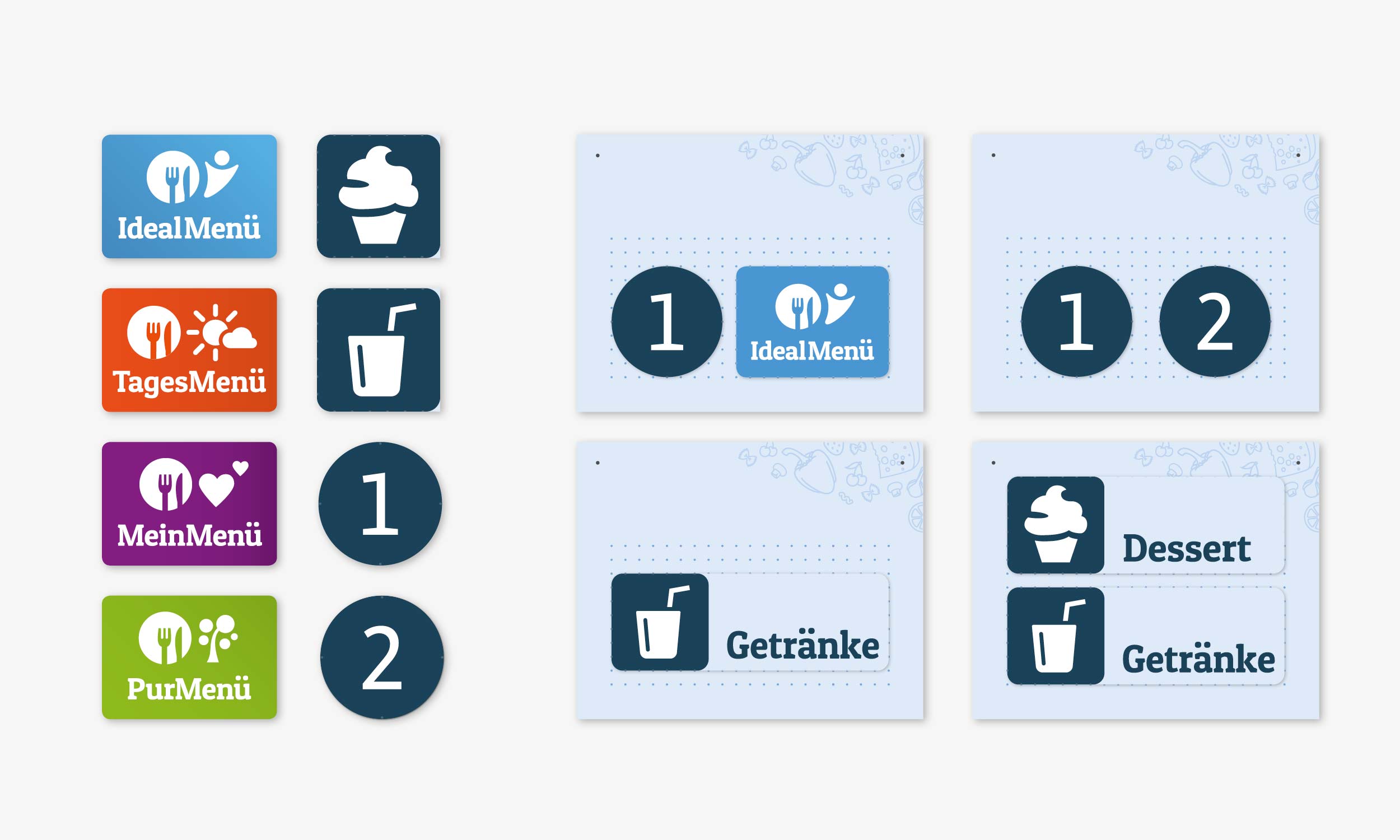
Illustration of the pictograms in different colours for the menu lines IdealMenu, DailyMenu, Buffet, MyMenu, PurMenu.
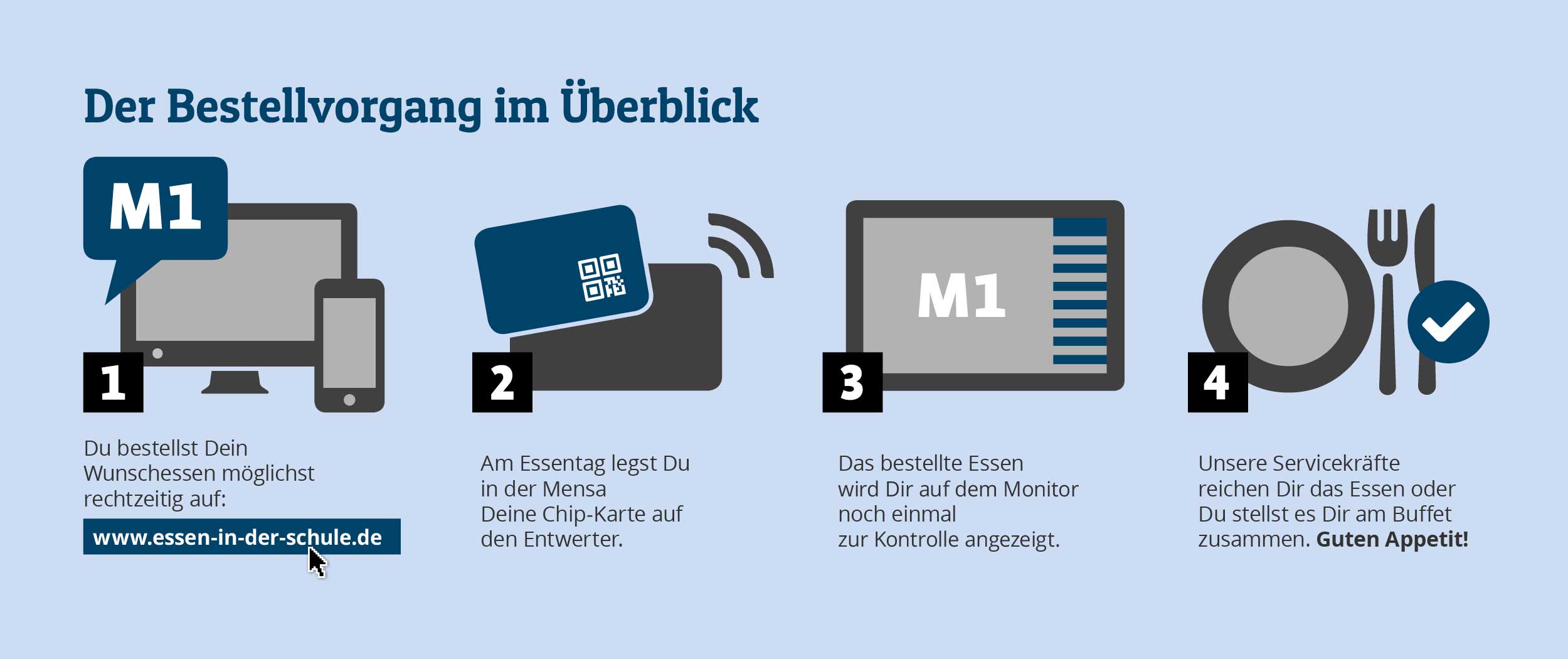
Illustration of the ordering and serving process in the canteen for new customers

Design for Canteens

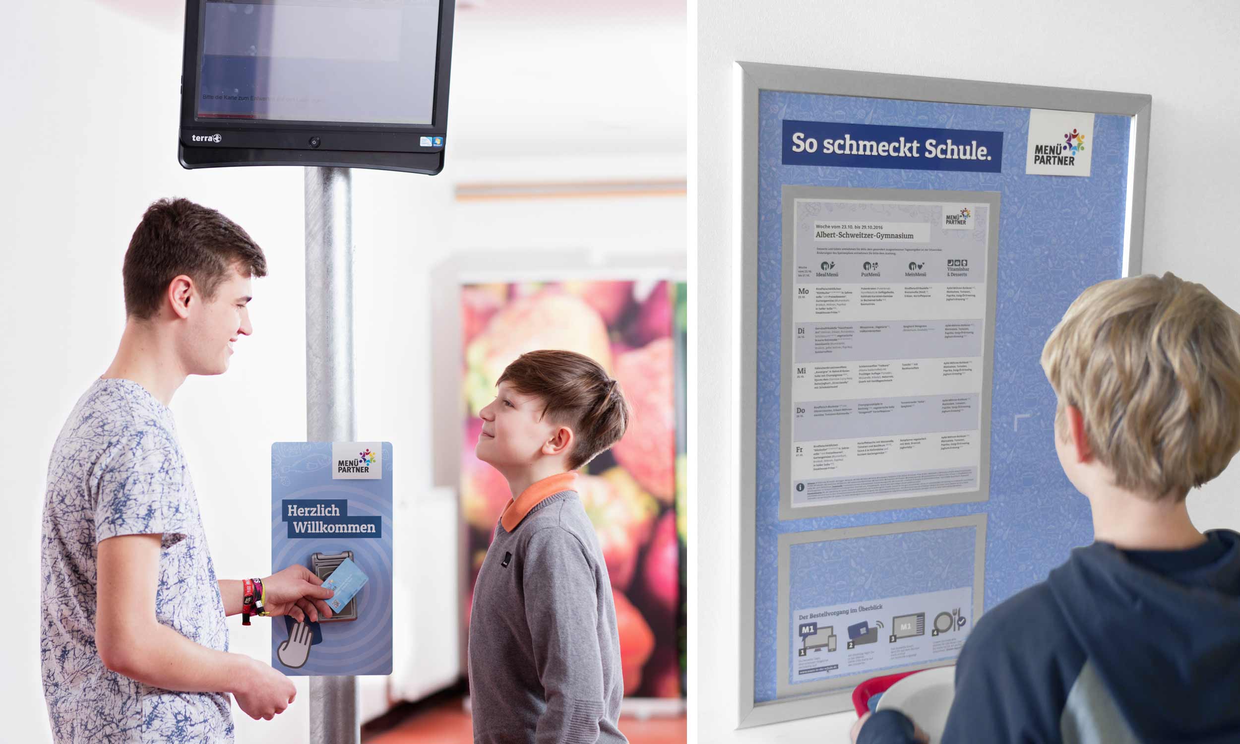
Two photos with students in front of the week's meal plan and validating their meal chip card
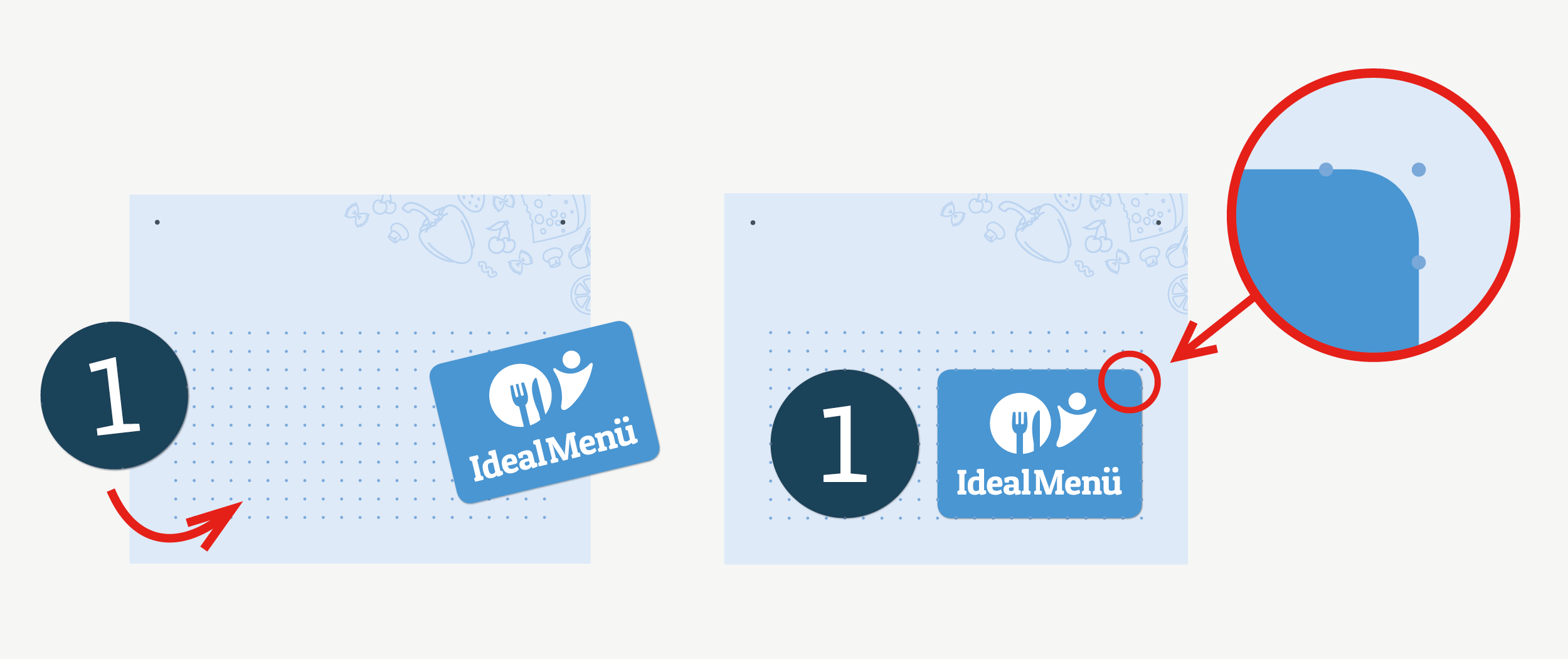
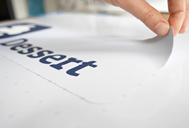
Illustration of an instruction for attaching replaceable foils to mark the menu lines at the serving points
Overview of the interchangeable foils for labelling the menu lines as well as drinks and desserts at the serving points
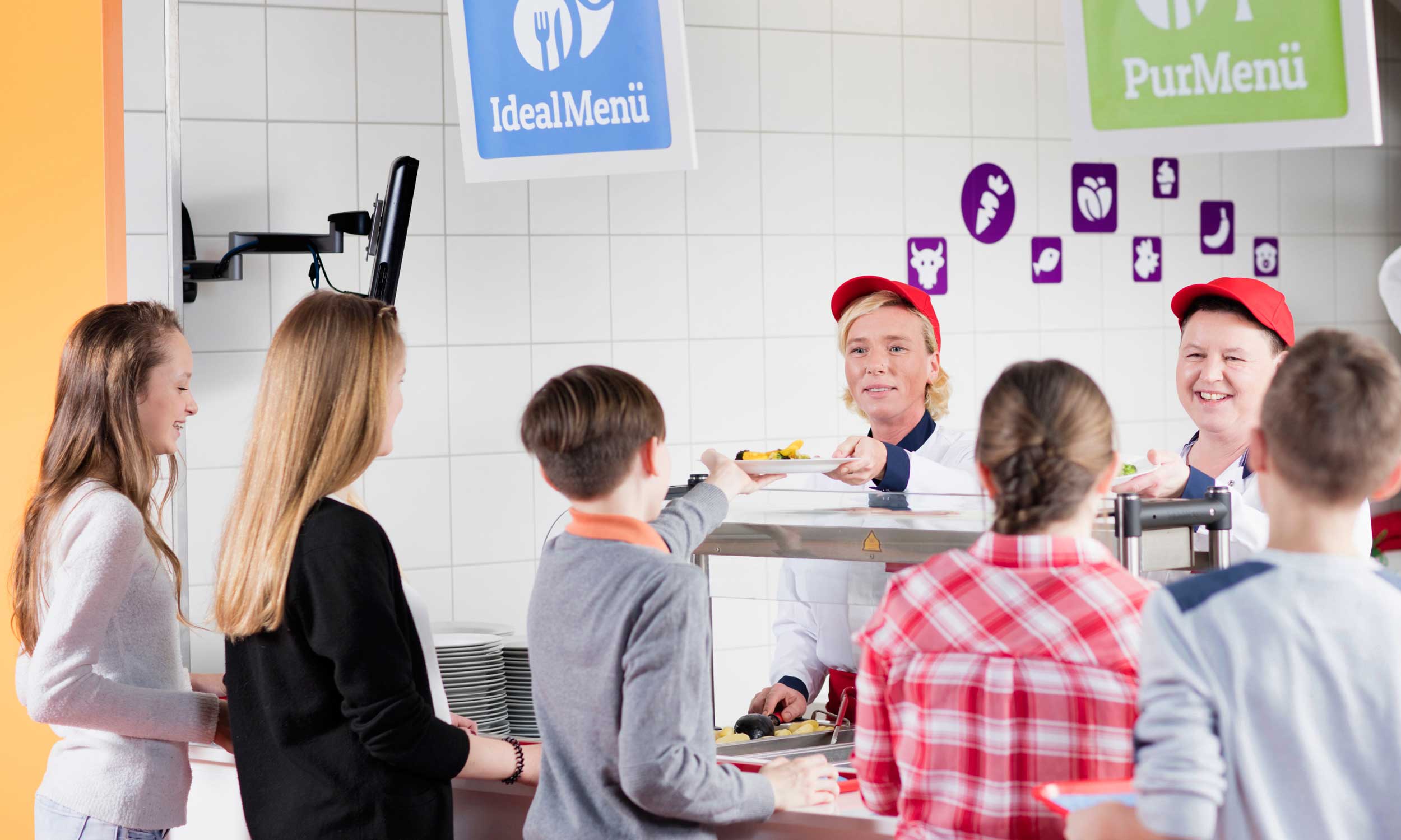
Photo of a modern menu partner food counter with children queuing and two servers behind the counter
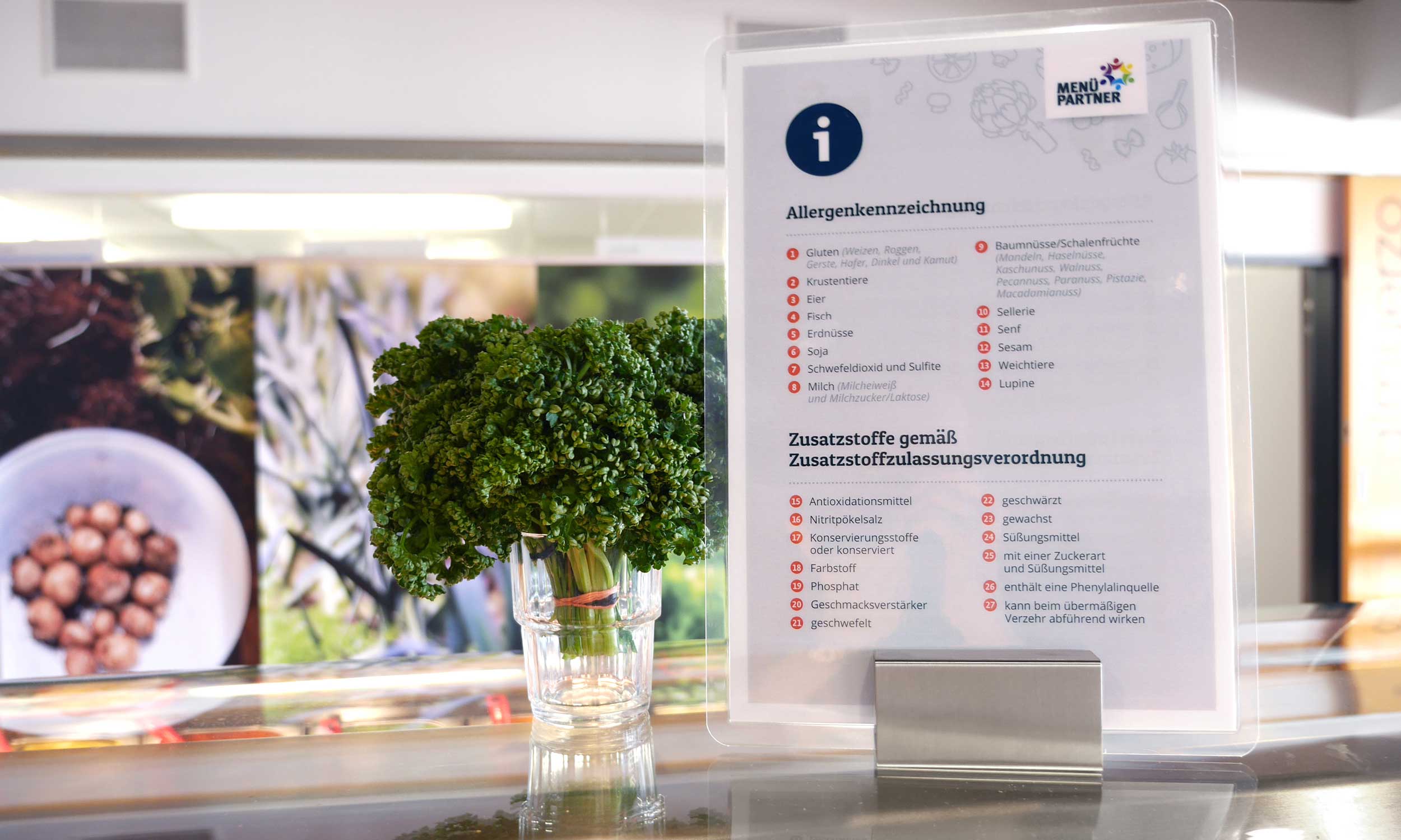
Photo motif of a display for the legally required labelling of allergens and additives on a self-service counter
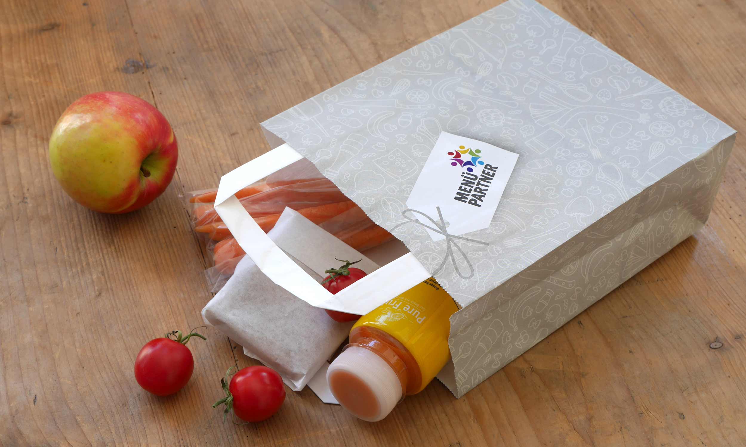
Photo of a paper food bag with healthy contents for field trips by day-care and school children

Visual Language

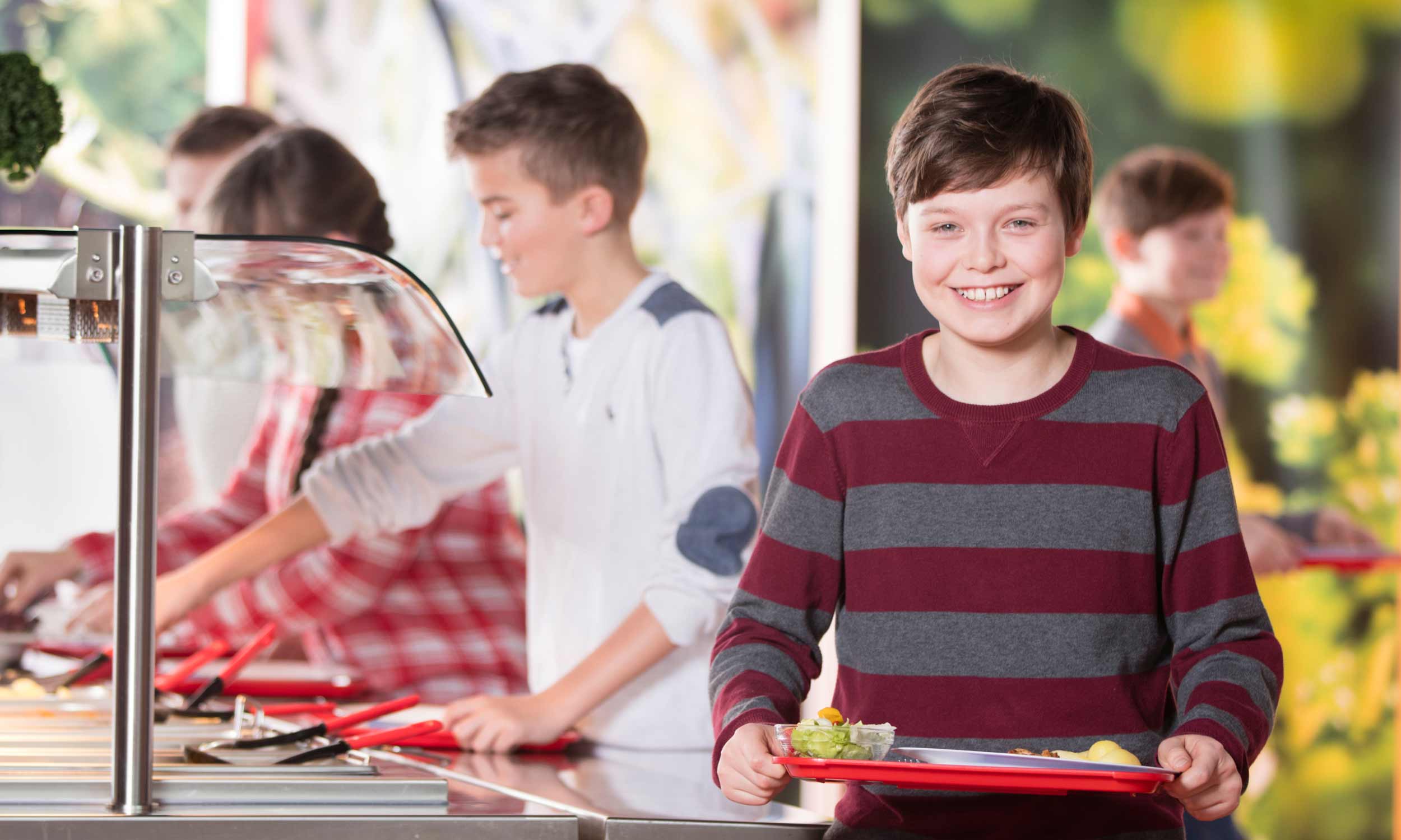
Photo of a boy with lunch on a tray that he has just put together at a self-service counter
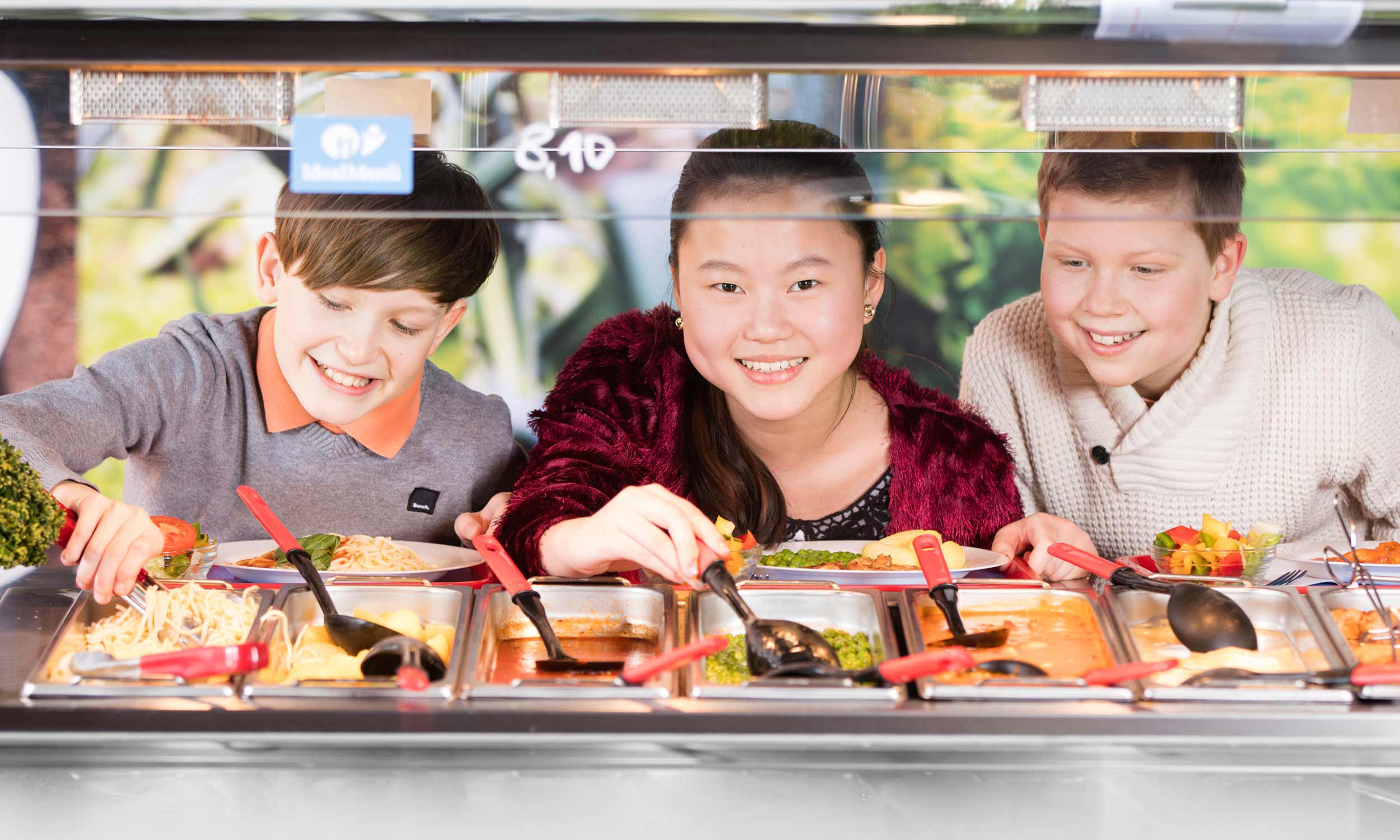
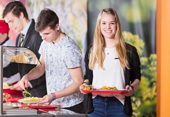
Photo with three pupils happily assembling their lunch at the self-service counter
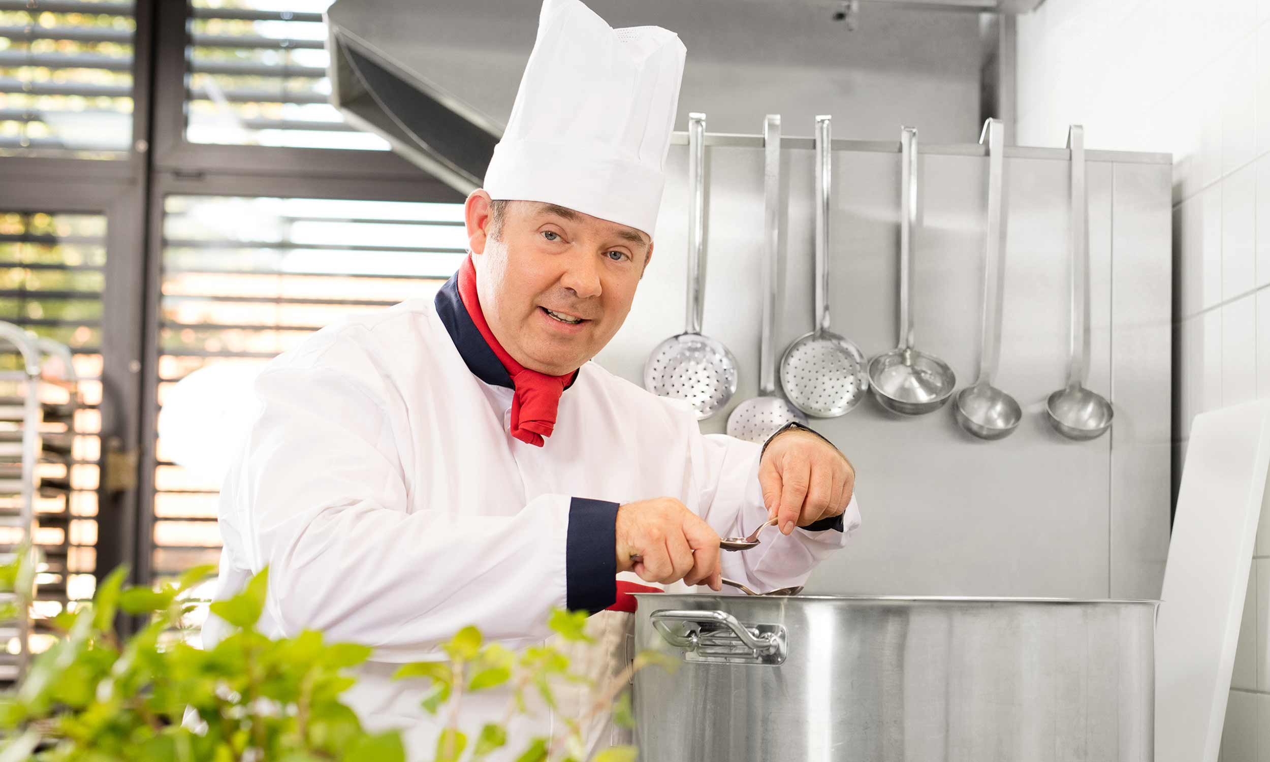
Photo of a menu partner chef at the cooker tasting the food
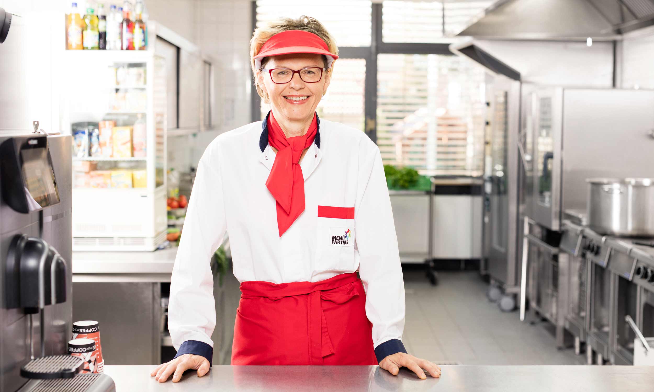
Photo of a menu partner service worker at the serving counter
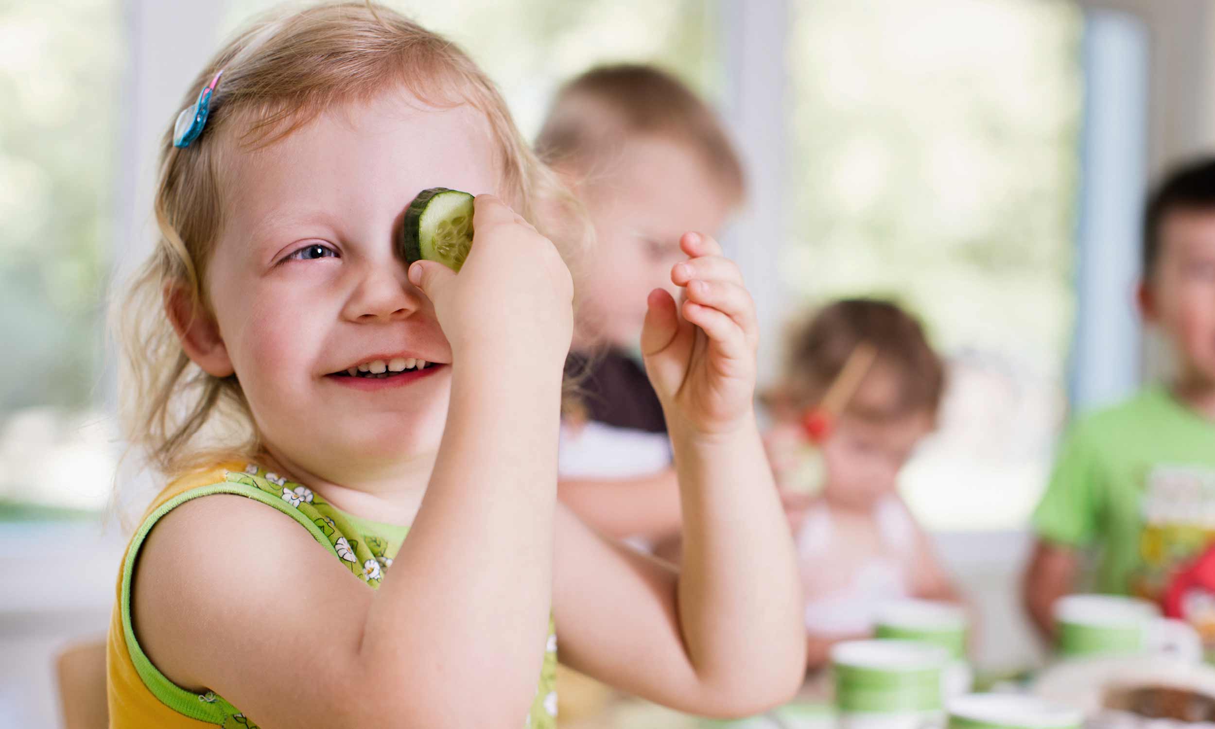
Photo of a happy nursery child at the table covering one eye with a slice of cucumber
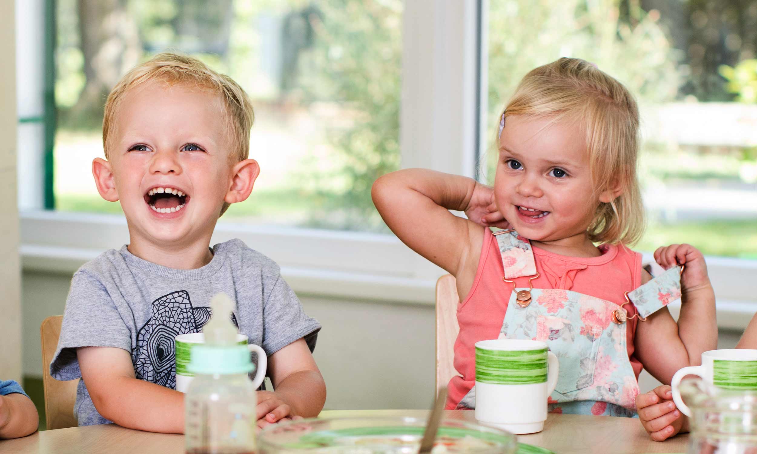
Photo of two laughing day-care children at the Vesper table

Digital Presence

Display of the website navigation of www.essen-in-der-kita.
Display of the website navigation of www.essen-in-der-schule.de on the computer screen, tablet and smartphone

 Project Details

Project Scope: Consulting, positioning, continuous brand development, visual language, extensive icon family – among others for the labelling of menu lines and food constituents, modular equipment catalogue for the labelling in school canteens, equipment catalogue for Kindergardens, layout and graphic design, look-and-feel, web design, photo shoots, illustrations, production management
Flat display of the green colour tone defined for promotional applications of the day care centre offers
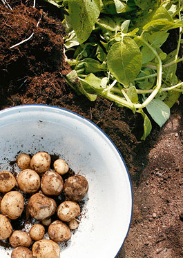
Photo of a display showing a bowl of freshly harvested potatoes in a potato furrow
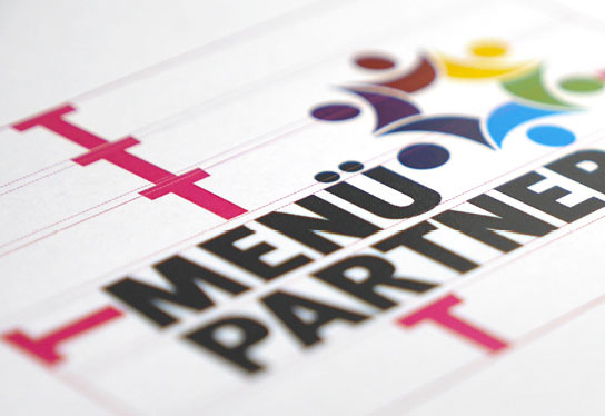
Detail photo with dimensions for the shelter around the menu partner logo
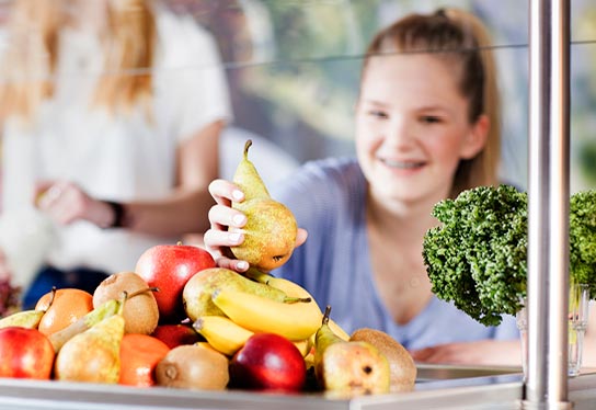
Photo of a pupil holding a food tray with fruit and lunch dish with both hands
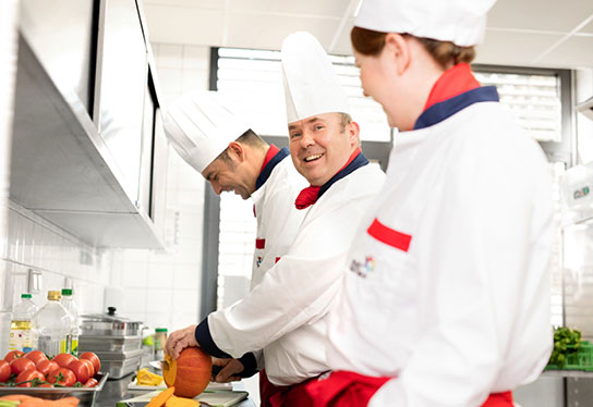
Photo with three cooks, one woman and two men, preparing fresh vegetables.
Figurative mark for the preparation kitchen, where cooking takes place directly in the establishment, consisting of a stylised cooking pot (white on a dark grey square), supplemented by a stylised chef's hat (white on a green circle) in the upper right corner of the square and a white plus sign on a smaller black circle.
Detail photo of a serving counter with a transparent protective cover on which a removable foil is applied to mark a menu line.
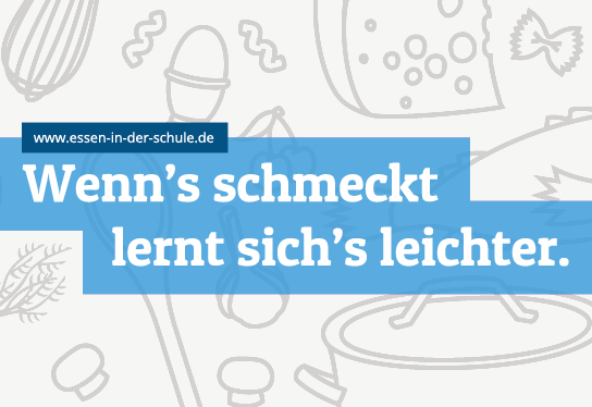
Cover illustration of a menu partner folder for schools with stylised cooking utensils and the slogan "It's easier to learn when it tastes good".
Figurative mark for the hot delivery, in which the already prepared food is delivered to the day care centre, consisting of a stylised cooking pot (white on a dark grey square), supplemented by a stylised clock (white on a green circle) in the upper right corner of the square.
Photo of a two-part turntable. A month is selected by turning it, and information on the seasonal range of fruit and vegetables appears in the lower window.
Flat display of the red colour tone defined for promotional applications of the day care centre offers
Detail photo for handling exchangeable adhesive foils for changing menu sequences
Representation of the colour orange, which was defined for advertising purposes for the offers of the day care centre
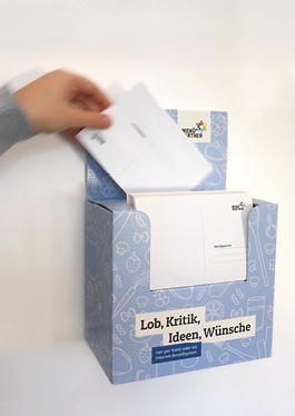
Photo of a note box for praise, criticism and suggestions from the food participants
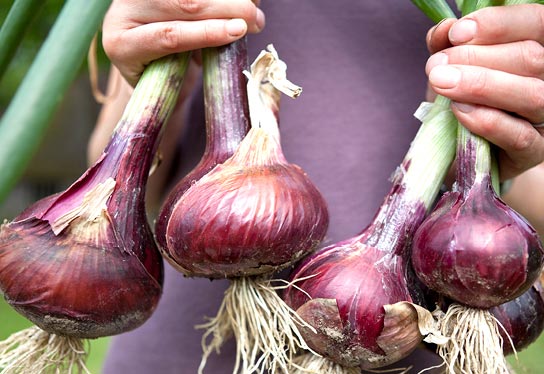
Photo of a display of fresh red vegetable onions with leeks in the hands of one person.
Creation of the menu for display in a day care centre with the help of magnetic foils developed by inkl. design.
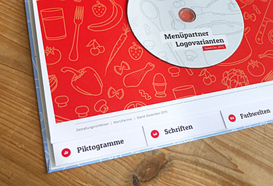
Detail photo of the corporate design manual by Menüpartner
Photo of three pupils helping themselves to the lunch menu at a serving counter
Representation of the blue colour tone defined for promotional applications of the school offers
Figurative mark for the chilled food system, in which the finished food is delivered chilled to the day care centre, consisting of a stylised cooking pot (white on a dark grey square), supplemented by a stylised temperature display (white on a green circle) in the upper right corner of the square.